Illustrating the Bridgerton Brand World
Credits
Illustrator: Maggie Enterrios
Creative Direction: Banna Tesfay for Netflix | Client: Netflix Consumer Products
™/© Netflix. Shondaland ™ Shondaland.
™/© Netflix. Shondaland ™ Shondaland.
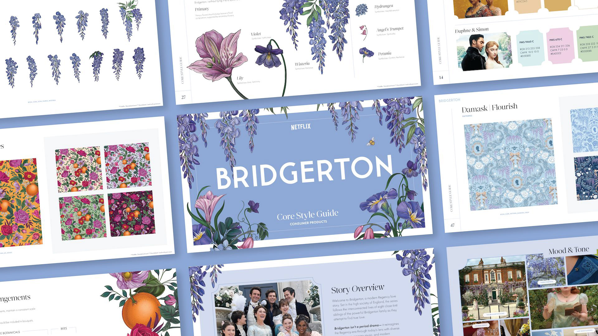
Two years ago, I signed on for the project of a lifetime: an illustrated pattern system for Bridgerton’s consumer products program. The team at Netflix posed a question: how do we reimagine a cinematic world as a design language that can extend across global brand partnerships while still feeling unmistakably Bridgerton? In other words, in an age of high-visibility collaborations, what does Bridgerton look like when it leaves the screen?
I was initially tapped by the lovely Banna Tesfay at Netflix to focus on illustrated florals (my specialty). But the full brief pointed toward something broader. I asked to try my hand at multiple illustrative styles: not just florals, but Regency-inspired toiles and damasks as well. It felt like a rare chance to shape a full visual language from the ground up.
Initial patterns created for Bridgerton, including Lady in Silver Florals, Core Damask, and Queen Charlotte Holiday Toile.
Ultimately, the system had to do much more than just look like Bridgerton. It had to function beautifully once it left my hands and landed on the screens of print designers around the world. Because so many brand partners would be working with the artwork, everything we created had to flex. No matter the style, each piece needed the ability to be recolored, cropped, layered, simplified or made more detailed depending on the context. From CPG to durable goods, experiential to retail, every illustrative deliverable had to feel like part of the same world.
I love a challenge. I really do. And the old adage, "Luck is when preparation meets opportunity,” certainly applied here. As fate would have it, my special interest aligned perfectly: I had spent the decade prior obsessing over the construction of flexible pattern systems. It was go-time.
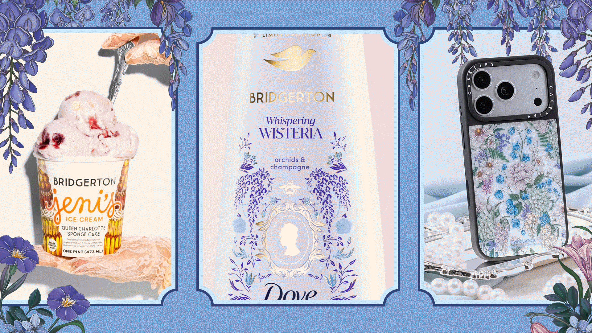
Bridgerton collaborations for Jeni's, Dove and Casetify, S4 2026
So We Built a Library
The tricky part was that I wasn’t designing for a fixed set of outcomes. The system had to anticipate uses we couldn’t even imagine yet: different partners with different products, each with their own brand voice and guidelines.
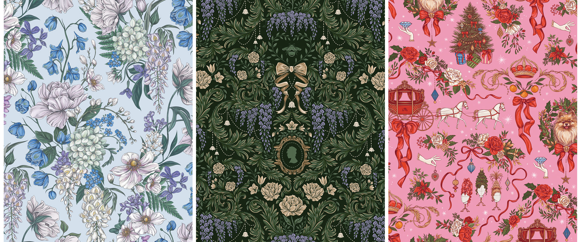
The final library took shape around those three initial pattern styles: damasks, toiles and florals. Each one offered a different perspective, and together they created a design framework.
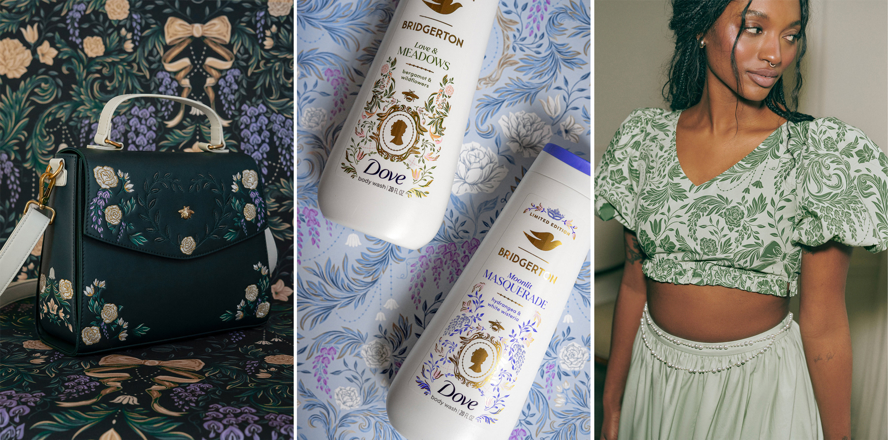
Damask utilized in officially-licensed Bridgerton collaborations with Loungefly (L), Dove (C) and Nuuly (R)
Damasks
For structure and flexibility, as either a subtle texture or as a hero pattern with an unmistakable Regency-era voice.
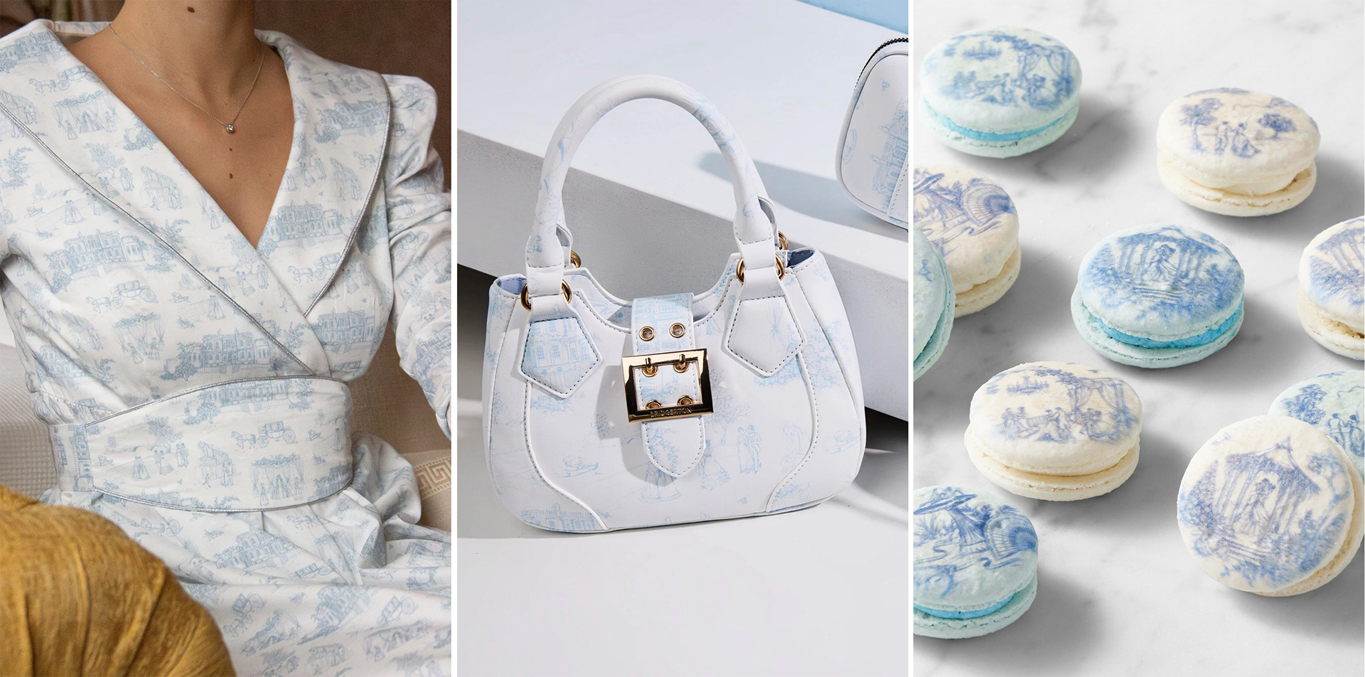
Toile utilized in officially-licensed Bridgerton collaborations with The IQ Collection (L), Deichmann (C) and Williams Sonoma (R)
Toiles
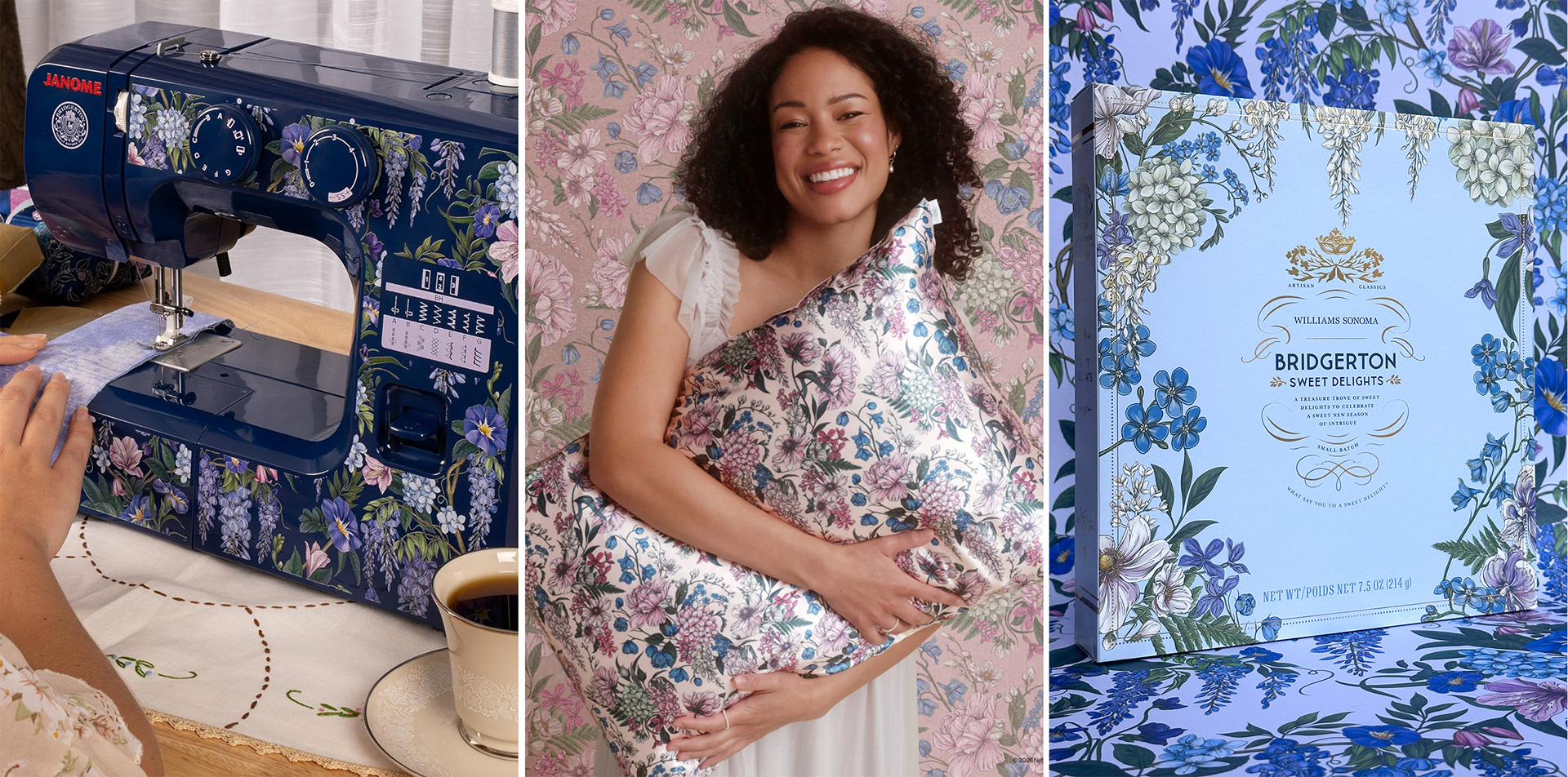
Lady-in-Silver Florals utilized in officially-licensed Bridgerton collaborations with Janome (L), Kitsch (C) and Williams Sonoma (R)
Built for the Ton’s Many Tastes
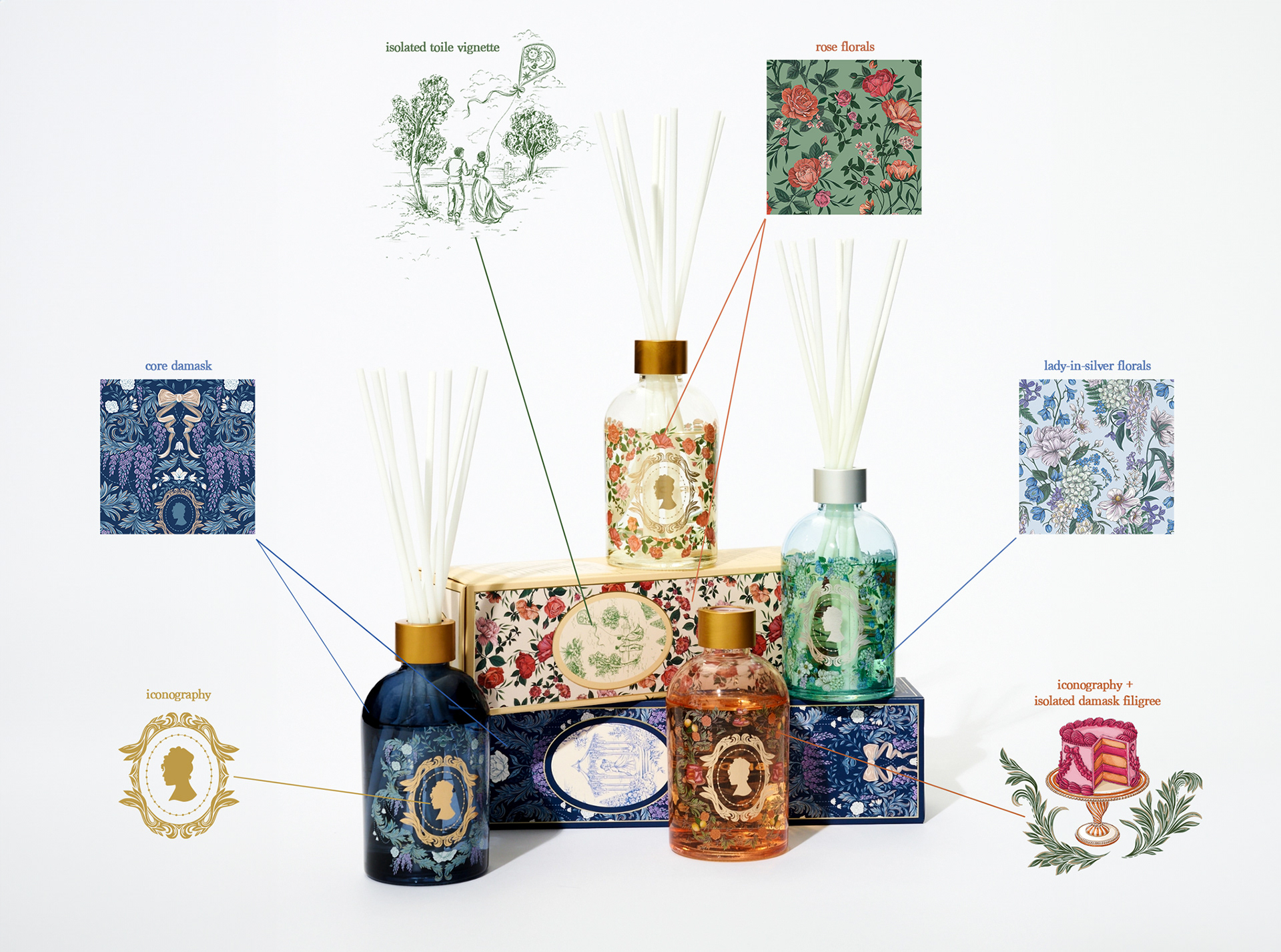
For each pattern style, I illustrated multiple patterns across a range of colorways, with every individual asset designed to stand on its own. Simply put, each pattern became a kind of source material: something that could be used whole, or pulled apart into smaller moments.
Once those pieces existed, they could start to overlap: damask flourishes could be isolated as borders or a single toile vignette could be tucked into a floral pattern. The library was built to flex and grow, with both fully realized compositions and the pieces to create something new. Kind of like Chopped, but with all beautiful ingredients.
Below, four of the floral patterns I illustrated for Bridgerton, along with a sample of how just this one pattern was designed and delivered with intended flexibility across varied brand partnerships.
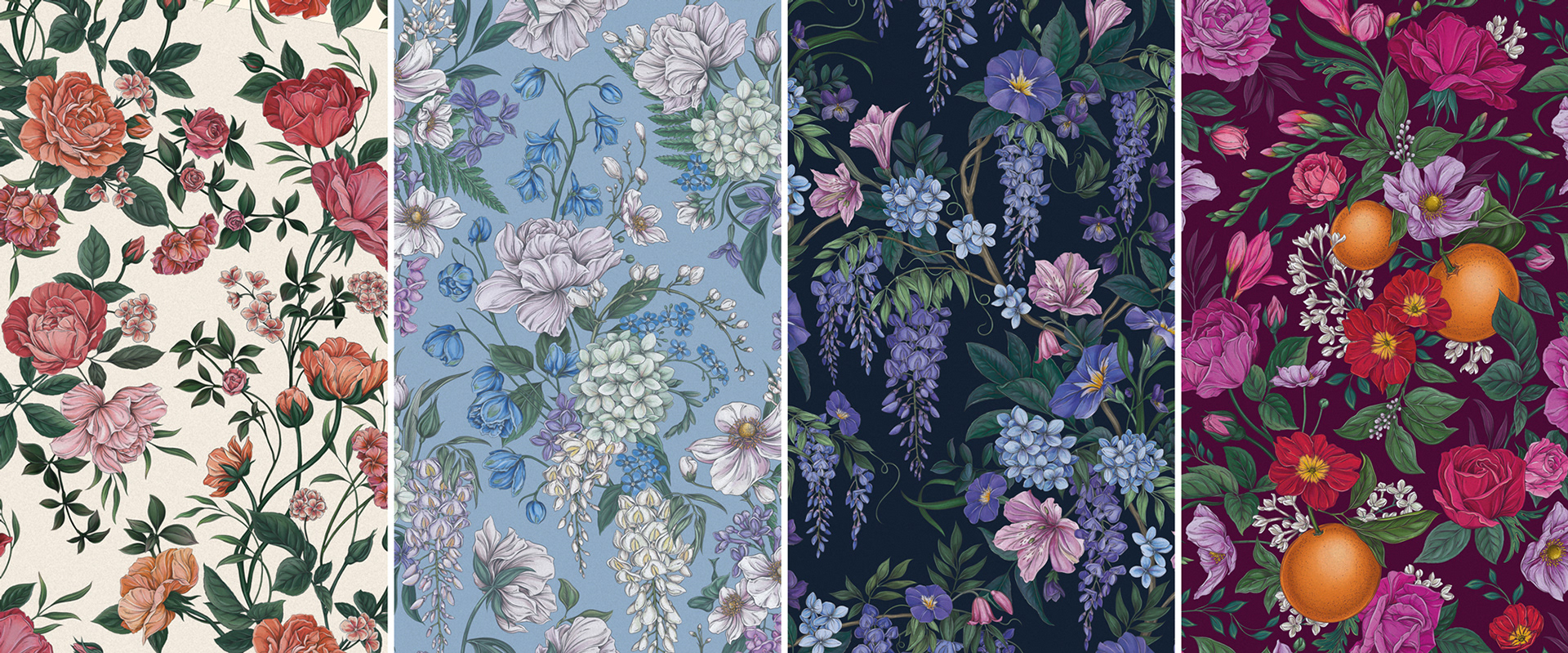
Four floral patterns created for Bridgerton by Maggie Enterrios for Bridgerton Core Brand, Bridgerton Season 4, and Queen Charlotte
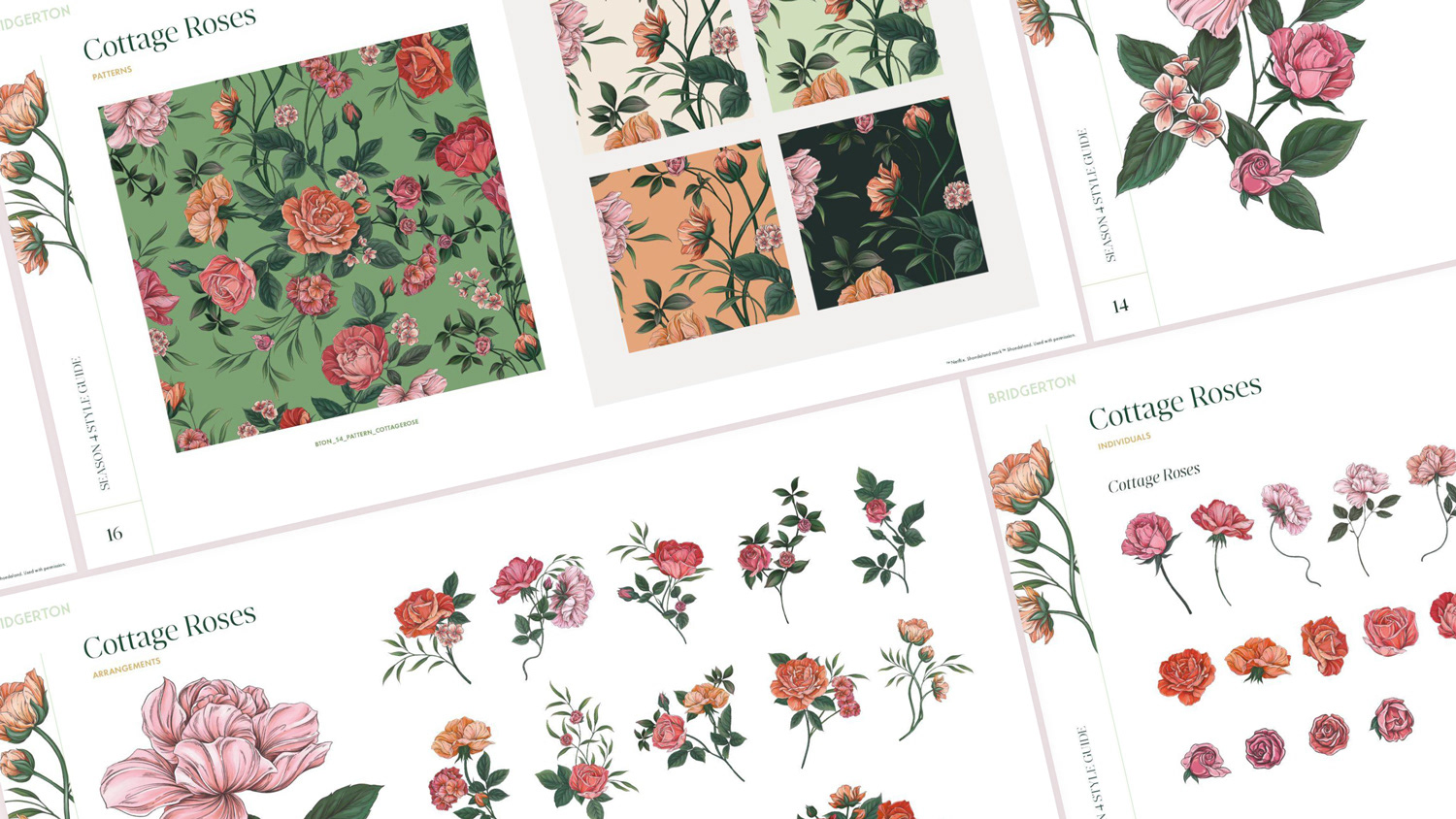
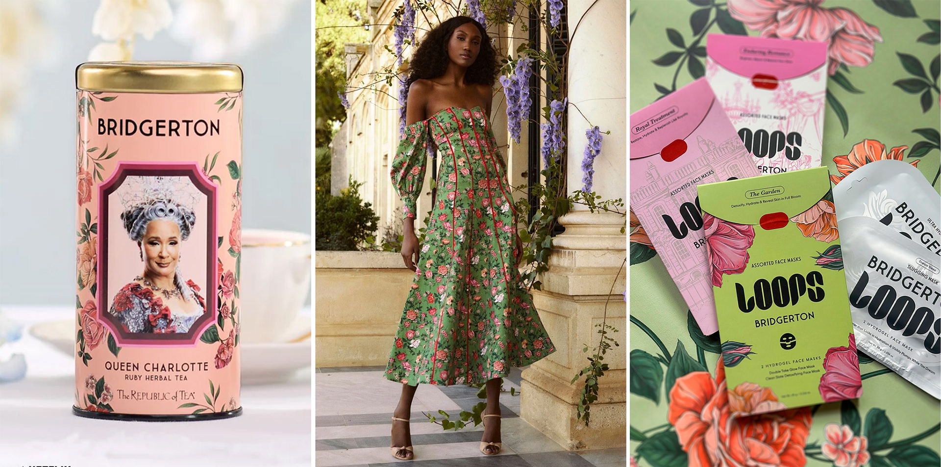
Above, Cottage Roses utilized as a border for The Republic of Tea (L), as a full pattern for the IQ Collection (C) and as spot illustrations for Loops Beauty (R)
The Library, In the Wild
Perhaps my favorite case study is Bridgerton x dusk - an Australian retailer of home fragrance products. Their team made use of nearly every pattern in the library, but more interestingly, they began pulling it apart and building custom layouts from elements sourced from multiple patterns, including a mirrored damask composed of filigree from one pattern and spot illustrations of desserts and fruits from another. Below, upper right.
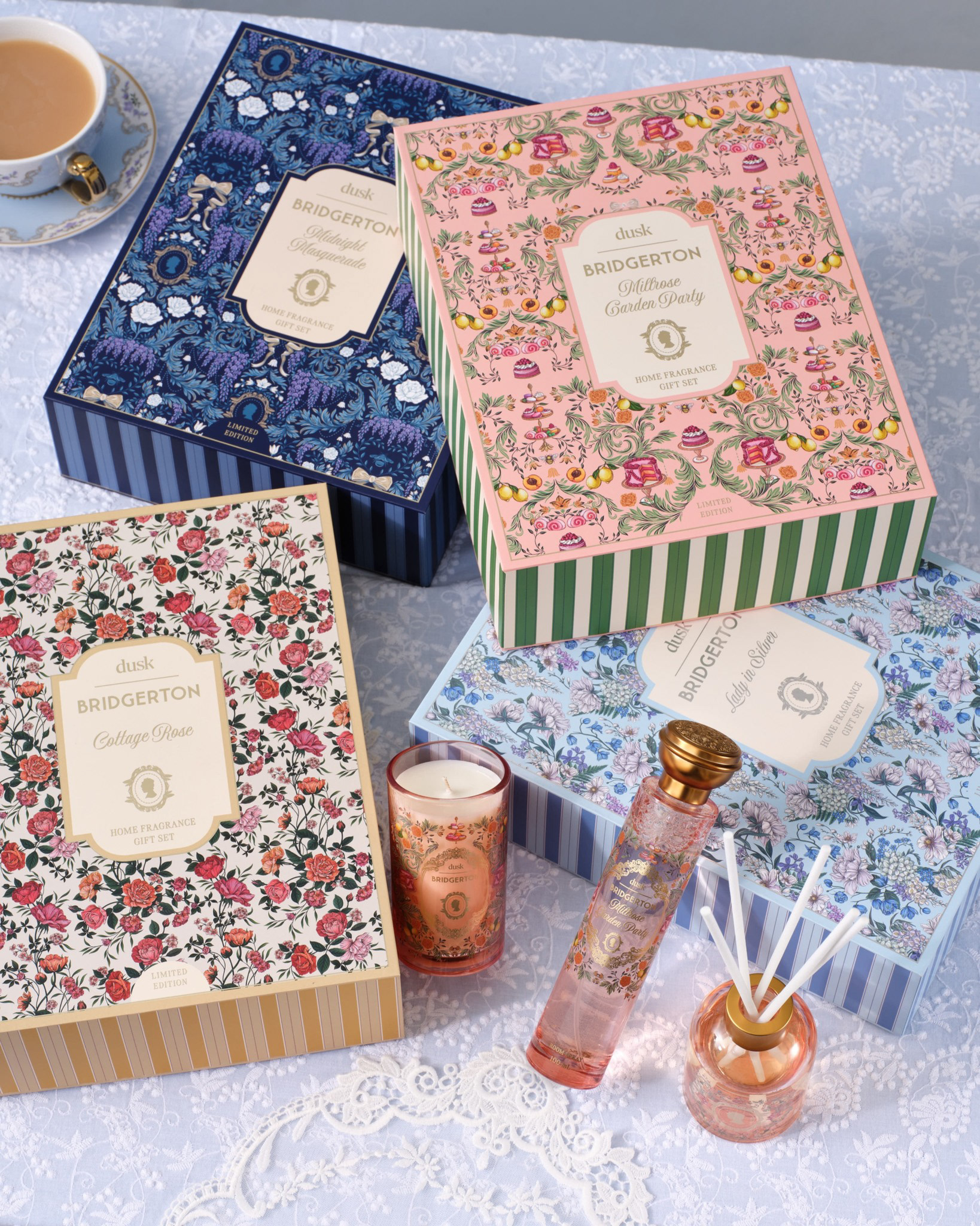
Packaging illustrations for Dusk x Bridgerton, artwork by Maggie Enterrios for Netflix.
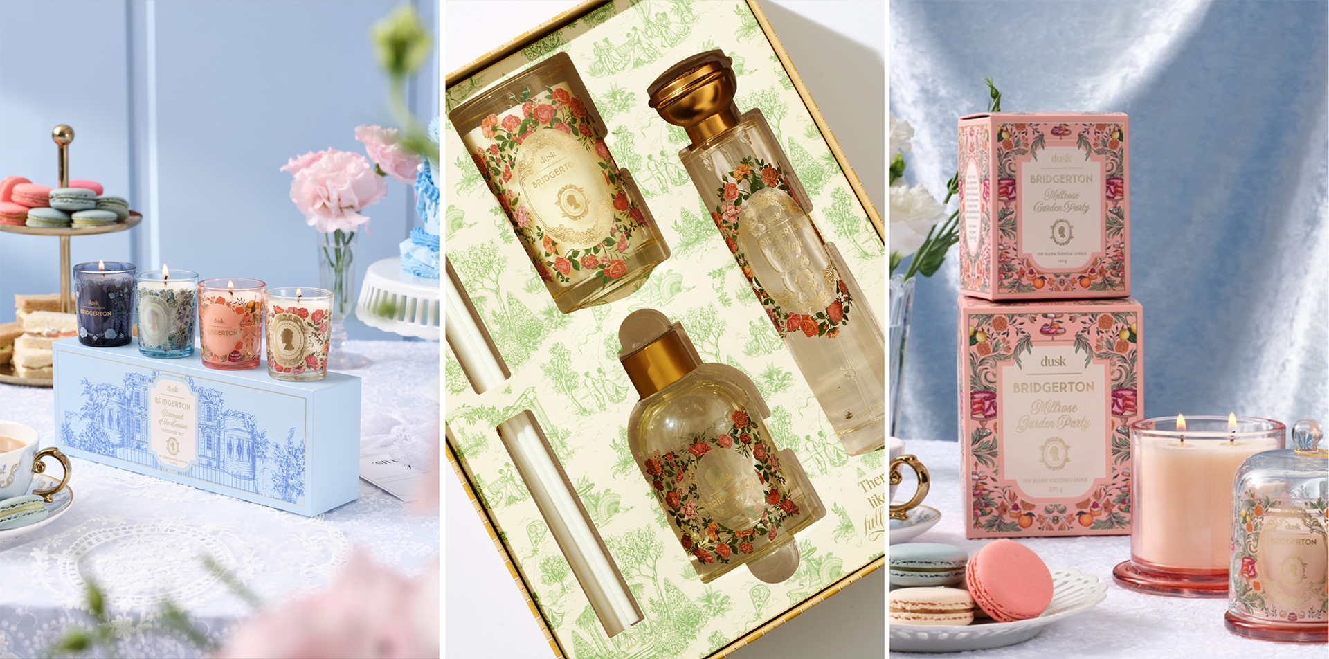
Dusk also found imaginative ways to extend toile across their limited-edition collection. Above, left, my illustration of the Bridgerton house was used as a unifying device for a collection of votive candles. Above, middle, the full toile pattern becomes a backdrop, with custom die-cut openings. Below, individual vignettes were lifted and inset into floral patterns, adding small moments of character-driven storytelling.
Overview of pattern styles found within the Dusk x Bridgerton limited-edition collection, Season 4, 2026
When I set out to build this illustration library, this is exactly what I had in mind. But seeing it out in the real world after two years is a particular kind of joy I don’t have the words for just yet.
In future posts, I’ll take a closer look at the artwork itself, one pattern style at a time, and the storytelling, color and illustration decisions that shaped the Bridgerton world.
For now, keep an eye out. Bridgerton collaborations have a way of popping up everywhere, and you may start to recognize the patterns. (See what I did there?)
-Maggie
See more at littlepatterns.com or follow me (@littlepatterns) on Instagram